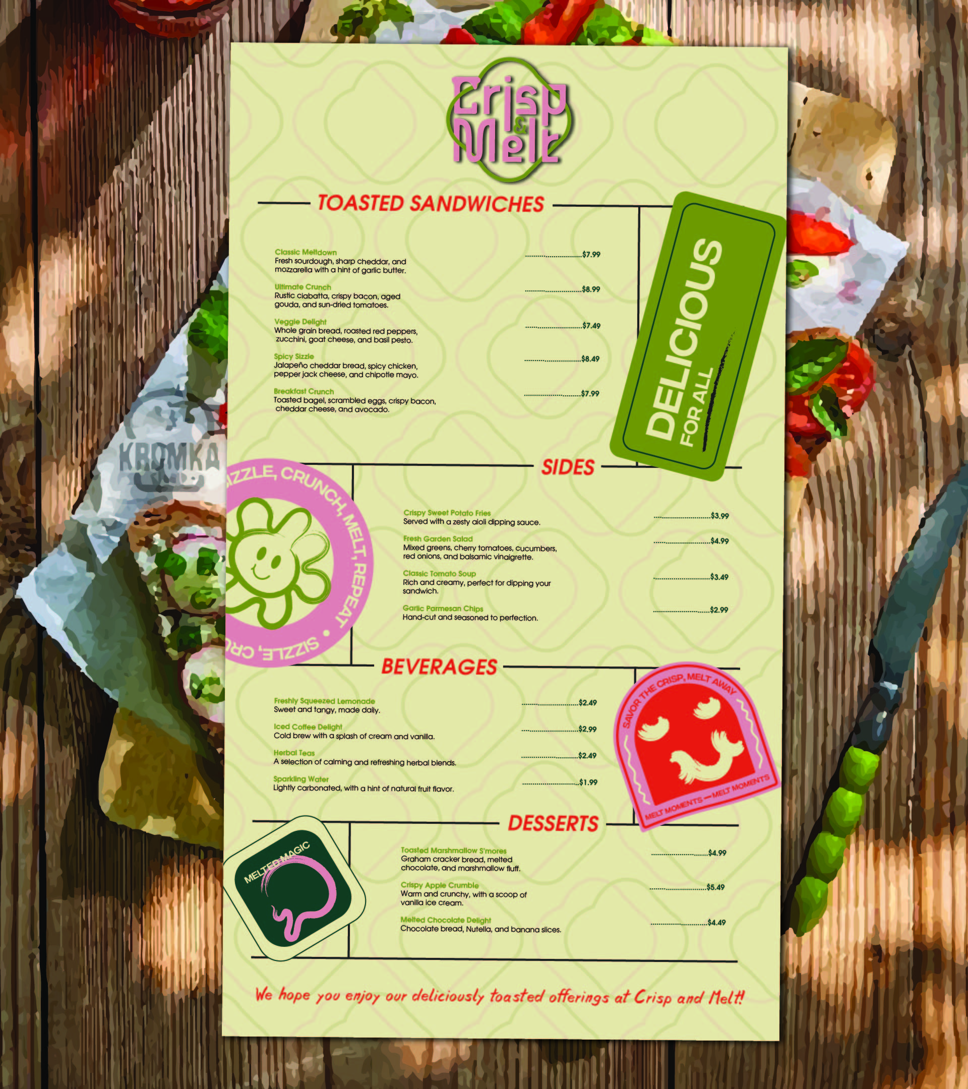
The goal was to create a brand with a vibrant, welcoming and trendy lunchroom where customers can indulge in delicious, high-quality toasted sandwiches.

Crisp & Melt a trendy lunchroom that specialises in serving delicious toasted sandwiches. Crisp & Melt offers an array of toasted sandwiches made with premium ingredients. The sandwiches are crafted with passion, ensuring each bite is delightful for your taste buds. They required a brand identity and menu design.
After much thorough research on the similar industry, target audience and competitors, I envisioned the brand as a vibrant, welcoming and trendy lunchroom where customers can indulge in delicious, high-quality toasted sandwiches.
So we aimed for a brand that create a memorable and delightful experience through its unique offerings, warm atmosphere and strong identity.

Colors
Primary colors:
Petite Orchid- the soft pinkish is used as primary color to represent that the customer can feel warm, happy and comfort while enjoying their sandwiches in the welcoming environment
Trendy Green- this color was chosen to represent calmness and soothing nature of the brand.
Secondary Colors:
Quil Grey- this color represent clarity and simplicity
Cyprus- this evokes tranquility and timelessness
Accent Colors
Cinnabar- this color evokes passion and excitement that the brand wants it customers to feel about the sandwiches
Mint Julep- this evokes inviting and comfort vibes